Now, it didn’t start that way of course! Since I took pictures along the way, I thought I’d show you the WIP (work in progress). Please bear with this image heavy post. I’m not sure why I feel the need to tell you all that though, since most of my posts are… Oh well!
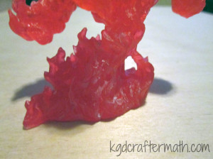
The mini I painted is Reaper’s Large Fire Elemental. It’s made of a translucent red plastic. For the lighting effected, I used a cheap halloween LED tea light.
I wanted to take advantage of the transparency and use some light, so I did some fiddling around. I played around with a Halloween led candle from Target. I also played around with a few other leds, but I found that the target one was the brightest. The only problem is that the light doesn’t penetrate the mini fully. With the non-target led, I placed it at various points behind the mini to see if I could get better spread, but it didn’t look like I could. I did drill a hole into the mini so that the led would go up a little bit, but I didn’t go so far as to de-solder the led from the board to make it longer. I might try that with my other fire elemental, but I didn’t do it here. It did help a little bit, but I would still like to get more light through overall.
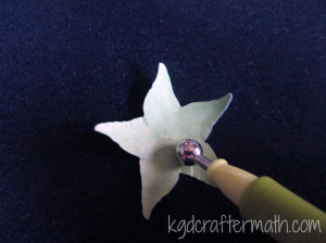
The very first thing I did was painted the elemental. Bones, that’s the plastic the mini is made out of, is super hydrophobic. I wanted to keep the transparency, so I knew I wanted to do a thin wash of paint. Normally you would make a wash with water and paint, but the material is hydrophic, remember? So I made my washes with isopropyl alcohol. Fire goes from really light in the center to red. I added the black sooty stuff on the outside to help with the fact that the led didn’t shine through the whole thing. I used a low ISO photo above to help determine how to paint the mini in accordance with the light spread.
First up: a coat of pure white around the bottom
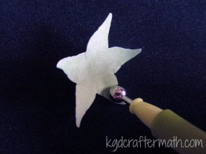
Next: a coat of sun yellow just above the white
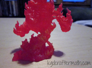
Then: a coat of fire orange above that. Note that these coats only go up to about half of the figures. That’s where the light mostly ends.
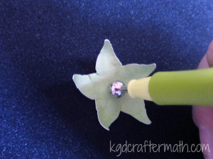
Next, I dry brushed a bunch of black on.
Then, I dry brushed some crimson red around the bottom. I didn’t want the bottom to be as dark as the top, though you’ll noticed I changed my mind on that later down the line. Somehow I forgot to take pictures of the last three stages, but, you can still see how it came out in the next few steps.
Once the mini was painted, it was time to add the LED light. First, I removed all the casing from the candle. This left me with the board, the bottom housing, the led, and the battery.
I had already drilled a hole into the fire elemental that went in as far as the led would go. This is where I could have done a bit more. I decided I didn’t want to deal with de-soldering and lengthening the led. This would have allowed me to put it further towards the middle of the mini and potentially have gotten a more even lighting throughout the mini. I should note that I wanted to keep the board because it flickered and it had an on/off switch. Sure, I could have done those myself, but it was much easier and cheaper to use the led candle.
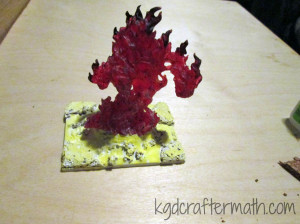
Now the electronics and the mini fit together! But… they need a base. I placed it all on a 2×3″ base. Why that size? Well, it’s what they had at my local shop. So there you go. Once I traced out where I wanted the led casing to go, I marked where the switch was. That was where I drilled a hole. You need a pen or something to turn it on and off, but at least you can.
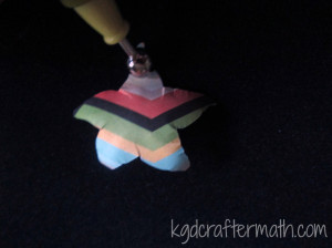
Then it was down to decorating the base. I knew that I wanted to hide the electronics. Also, I wanted a lava effect, so I started by sculpting a crater like thing around the LED strcuture with some milliput. Milliput is also a very strong adhesive, so this keeps the mini attached as well. I like to imagine that the fire elemental is emerging out of the crater.
For the raised bits of pumice and other refuse in the lava, I used some cork. There is a larger piece of cork on each corner and then some crumbled cork that I added around the crater. All the cork is adhered using zap a gap super glue. I used the tutorials by Dark Art Studios and Fantasy Games as inspiration and for help in figuring out how to get the look I wanted.
Once the cork was down, I flooded the base with Elmer’s glue. And waited for it to dry. And waited. And then gave up waiting, and hit it with a blow dryer until it was at least dry enough for me to paint on it. Bonus! Since the glue wasn’t entirely dry, I ended up smudging it some along the way. This gave the lava a swirled effect in some places, which was kind of cool.
Then I started layering on the color. Most of the color is dry brushed or just sort of haphazardly splattered about.
First: a (mostly) solid True White coat.
Dry brushed sun yellow
Dry brushed marigold yellow
Dry brushed lava orange
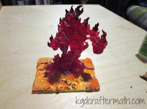
Dry brushed crimson red
Dry brushed blood red
Added a layer of walnut brown to the top of all the cork (I left a little of the red showing). I also added a ring of brown just underneath the elemental.
Added a layer of black to the tops of the cork (I left some of the brown showing). Finally, I decided I wanted to dry brush some more black onto the main figure. That’s it!
Then it was into the light box for some photos!
It took me evenings, one for the electronics, sculpting, and mini painting, and one for the base construction. Not including drying time, I think it took me 3-4 hours to complete. I hope you enjoy it! I’ll probably apply the same treatment to my other large fire elemental, except try to get better lighting by drilling a deeper hole. I’ll be sure to post it here if I do!
]]>Truth be told, I wanted this to be my first silhouette project, but I jumped into the paper so fast that it had to be left out. So what did I do? Well, I decorated my silhouette!
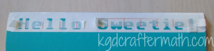
A bit of geeky background: when you learn to code, often the first thing you learn is to print out “Hello World!” on the screen. This is true no matter what type of code you are learning. I wanted to geek it up a bit, so I choose to do “Hello Sweetie!” instead. It’s a common greeting from River Song to the doctor in Dr. Who. I coupled that with the Commodore 64 font. For the font, I choose the angled version. Even though I really like the pixelated version, I was afraid it would just look really weird on the front of my machine. The vinyl I choose was the Silhouette turquoise vinyl, since it was the closest they had to green. I wanted it to be a bit of a throw back to the old black screens with green text.
It took me all of 5 minutes to install the font, open up Studio, and write out the phrase. I made it large enough to stretch the 12″ and added a straight line underneath for easy removal of the excess. Here is what my studio file looked like:

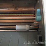
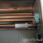
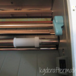
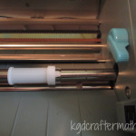
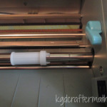
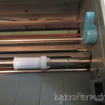
This is the first time that I am cutting directly on the media and without a mat, so I had to figure out how to adjust the rollers. Turns out it’s really easy! Just flip the blue tab down, twist the white roller so that it isn’t locked into place, move it to the right length, twist it to lock, and flip the blue tab back up again! The only trick is that you need to hold the silver rod steady while you twist and move the roller.
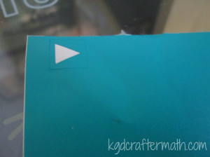
Next, I printed a test cut. This cuts out a square with a triangle inside. Since this was my first vinyl cut, I wanted to make sure it would cut right. It cut perfectly. I’m not sure why I had any doubts. In the picture below, I’ve removed just the triangle.
Now it’s time for the vinyl cut! Here’s a picture with all the extra removed, since it’s hard to see the cut lines.

At this point, all of 15 minutes has passed.
Now for the transfer paper! Ok, tip for all of you newbies out there. The transfer paper is the light paper with the grid lines on it, got that? So don’t crumble up the lighter stuff and toss it aside (oops!). Good thing I didn’t need much! Here is my transfer paper all cut and placed on top of my text.
From there, just carefully lift up the transfer paper and align the pieces where they are meant to go.

The transfer paper pulls off really easy, and then I just gave it a quick pat down. I did have to move the point of my “!” separately, but it worked out fine in the end. Now my silhouette gives me a nice greeting every time I see it, and I get a bit of Dr. Who injected into my day. Much like my blinds, this bit of Dr. Who will put a smile on your face even if you don’t get the reference.

Next I want to print out a circuit board paper background for the buttons on the right. It will be really easy and take maybe 10 minutes, but that’s for another day.
All told, this project took me about 20 minutes. I think it took longer to put together the post!
]]>
After I wound all of my yarn skeins, I finally caved and cast on not 1, but 2 new knitting projects. One of them I’ll share when I’m done, probably next week, since it’s a relatively small one. The other is the pair of O.W.L. mittens that I am making for a friend for Christmas. She picked out the yarn and I’m doing the knitting. Yay! The pattern comes from the Unofficial Harry Potter Knits magazine that also has the Dumbledore socks in it.
O.W.L. Mitts by Celeste Young
Hour 1: Casting on and rib knitting
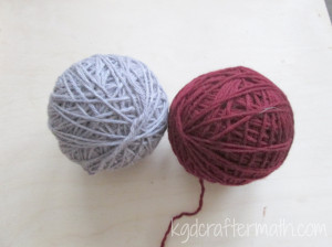
Sarah, my friend whom these are for, choose a beutiful burgundy and grey from the Cascade 220 line for her mittens. They happen to be the colors of my high school, so every once and a while I get flash backs and think I’m knitting a bobcat or something. The cast on and the ribbing knit up pretty quickly. I just used a long-tail cast on.
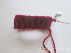
Hour 2: Finishing the ribbing.
These really do seem to be knitting up faster than the socks. I think part of it is that I’m in the knitting groove again, and part of it was that the ribbing pattern is easier for me to follow than the seeded rib from the socks. Anyways, by the end of hour 2 I had finished the ribbing and started on the pattern. I also added an additional row of contrast and color before starting the pattern since I really didn’t care for how close the text is to the bottom in the original pattern.
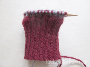
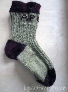
Hour 3.5 – Patronus
Ok, so here is where it gets a bit tricky to document. I took my picture after the first row of text. Since I only did a row at a time here or there, it’s hard for me to get an idea of exactly how long it took to knit up the section. I checked this morning, and it took me about 10 min. or so to knit up a single row. So I think it’s taking me about 1.5 hours. For now, that’s how I will label them. It will help with my OCD to take the picture at the end of each text block, especially since I’m only knitting a row or two at a time.
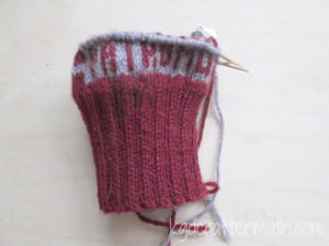
Hour 5: Incendio
Here is the next text block. I’ll try to take a picture from both sides from here on out.
There you have it, a few hours of knitting. At five hours, that’s 1 hour for each week night. Not bad. As you may have noticed, I’ve started to take my pictures on a piece of unfinished wood, and I think I like the results a lot better than the black or the cream canvas. What do you think?
]]>Hour 15: Letter Boxes
I decided pretty quickly that I was happy with the length and switched to working on the letter boxes. It took me a bit to get the centered the way I wanted, but once I did I was off and knitting.
Hour 16: Finishing the Letter Boxes
Not much interesting here to say. The letter boxes went faster though, since most of it was knitting. The knit-purl switch off is something that my fingers still haven’t gotten used to. I’m not sure they ever really will.
Hour 17: The Cuff
Interestingly, the rib pattern didn’t bother me too much. The title here is a bit of a misnomer. I did start my rib and then have to completely pull it out. I forgot that when working in the round, you don’t need to switch from knit-purl to purl-knit. Oops. That mistake cost me an hour.
Hour 18: Binding Off
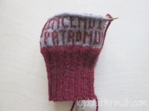
A little more cuff, the bind off, and the first of the letters. I embroidered them in from right to left. I’m not sure why, but it made more sense for me to do it that way.
Hour 19: Stitching the letters in
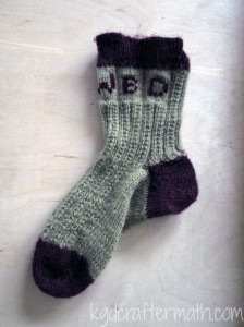
Look, it’s a finished sock! I only have one sock, so this project is really only half way done. Not counting lost hours, it took 19 hours. The final length ended up being maybe about crew length? My sizes last time were off since I was just measuring against my leg without putting it on. Overall, I’m happy with the length though. I know that I need to cast the other sock on soon, but I won’t be posting too much about it here. My plan is to cast the sock on and then start interspersing another craft. Anyone interested in quilts? I have one that I really need to finish by Christmas, so that will be my next set of posts. I’ll try to switch around weekly as well. I have some other knitting projects and a few smaller projects that may or may not merit a tutorial.
All that said, here’s what to expect for my Wednesday crafting hour. The posts will be interspersed with different projects which include a pair of knit gloves, a quilt, and some miniature painting. Since the semester is started up, you might get some metal working in there too. That’s all for today, I’ll see you again on Friday if not sooner!
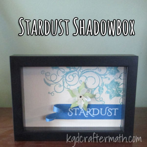
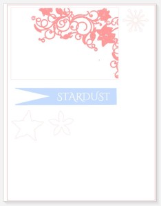
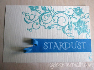
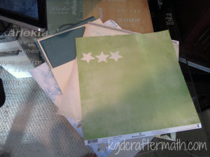
]]>So how did I get to a Stardust shadow box? It’s a bit of a story. When Earl and I got married (3 years ago), my youngest brother Nate gave us a set of 5 shadow box frames. I really liked them, but have been trying to think of something to do with them, so they have just been sitting around. In the past few weeks several things happened that all came together nicely for this project. A few weeks ago I got my new Cameo, which has had me constantly thinking of new paper projects to do. Among those projects is a tutorial based on the paper flowers I made for my wedding. Each flower was made from the pages of fantasy books that Earl and I chose, including Neil Gaiman’s Stardust. Around the same time, The Thinking Closet did a post about making her own sketch art with her Cameo. Shortly thereafter, it all came together. I could use my Cameo to make some 3D paper art based on one of the Stardust cover art versions and put it all in one of the shadow boxes we have. I’m not sure what I’ll do with the other four boxes. Earl and I talked about doing artwork based on the other books we used or possible just using Gaiman, but we haven’t really decided yet. Rest assured, you will here about it here when we do decide.
Image source: Audible
Here’s how I made my shadow box! It’s just the directions, but I’ll add another post on how I designed the box later.
Materials:
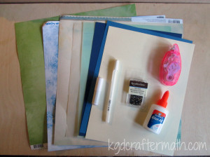
Assorted Paper:
Cream color for background
Blue for banner
White/blue/or vellum for flower
Green for leaves
1 Mini Brad
Double Sided Tape Roller
Elmer’s Glue
White Pen
Blue Pen (Not Shown)
If you don’t have a silhouette, you will also need:
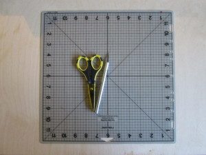
A Self Healing Mat
Paper Scissors
An exact-o type knife with a new blade
Skills Needed: Cutting, gluing, and shaping paper.
Step 1: Download the patterns
If you have a silhouette, you can use these directions to work with the silhouette file I made and follow the steps in order. Otherwise, you can download a .pdf with the images and text. If you are using the .pdf, print the file out on each of your colored papers and hand cut the shapes out. With the .pdf, print at actual size, cut your shapes using your scissors and exact-o blade, and skip down to step 5. Both patterns are designed for a 4×6 image.
Step 2: Cut and Draw the background
I’m assuming that you are using 4 different colors: the leaf, the flower, the banner, and the background which also doubles as the center of the flower.
For the background, you first need to ungroup the main design. Click on the main design and go to Object – Ungroup. Now click on the cut style button in the upper right ![]() . Make everything no-cut except for your box and the center of the flower. It should like like this:
. Make everything no-cut except for your box and the center of the flower. It should like like this:
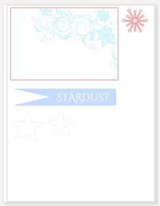
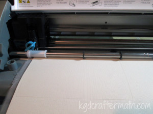
Without removing your paper, go back to the silhouette program and change your cuts so that only the floral design is being cut. Switch your blade for your blue pen, change your cut settings, and send the design to the silhouette. Here is the second cut:
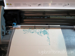
Now you can unload your paper.
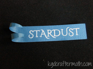
Step 3: Cut and Draw the banner
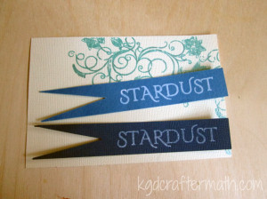
Move the main background out of the way and put your banner up top. Now click on the banner and ungroup that by going to Object-Ungroup. You will make two cuts here as well. First, set everything but the banner to no-cut. Cut your banner out of your blue paper. Keeping the paper in place, change the banner to no-cut and the text to cut. Switch out your blade for your white pen and send the design to the silhouette. Unload your blue paper.
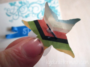
Step 4: Cut your flower and leaves
For the flower and the leaves, make sure that only the flower or leaves is set to cut depending on your paper. There is only one cut on each of these papers, so once you have cut out the shape you can remove the paper.
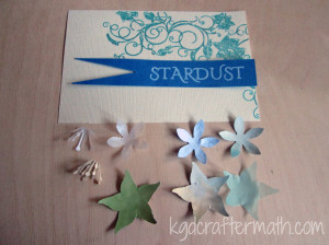
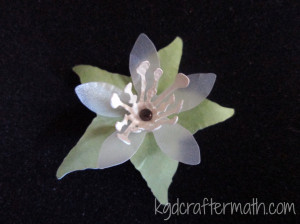
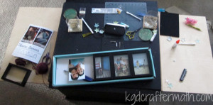
I wanted to experiment with several different colors for the leaves, flowers, and stamen. Below are all the bits I cut out with my silhouette. In the end Earl and I chose to go with the lighter blue banner, the silver velum flower, the bright green leaf, and the cream stamen.
Step 5: Curl your leaves
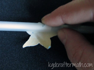
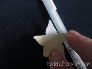
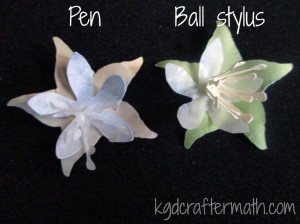
You can use one of two tools to curl your leaves and petals: a ball stylus or a pen. I used my ball stylus and foam molding mat because I like the way it looks better, but either works. I’ll show you both here.
First, you want to roll your leaves up towards the center. With the ball roller, simply place the roller near the center of the leaf and press out to the edge. Do this for each leaf. After you have rolled each leaf up, put the ball in the center of the leaves and depress the center a bit by using a circular motion. Then, turn the leaf over and roll just the tips back down. I like the rolling look this gives the leaves.
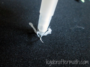
If you are using a pen, wrap the leaves around the pen going towards the center. Repeat for each leaf. Flip the leaf over and wrap just the tip in the opposite direction.
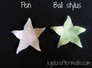
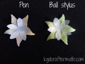
Here is a comparison photo of both methods:
Step 6: Curl your petals
Follow the same steps as with the leaf, except don’t roll the edges backwards. Instead, press the flower down very gently with your hand to flatten it a bit.
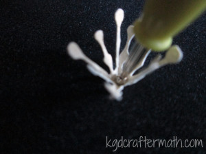
Step 7: Curl your stamen
To curl your stamen, press down the center with either the tip of your pen or a smaller ball stylus. Then pull each stamen bit up.
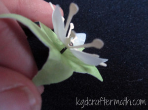
Step 8: Assemble your flower
Use the brad to assemble the three parts of your flower. If you cut your flower with the silhouette, there will be a hole there for you. If you printed via .pdf you will need to punch one through with the brad. If you flatten your flower as you assemble it, just re-work the shape with your hands a bit. It will be more pliable now that you’ve already shaped it above. Either way, you will probably have to pull your stamen up to the center again.
Step 9: Color in your banner and background
The silhouette file only colors the outline of the text. Just color inside the lines with the same pen to fill out the text. I went over the text 4 times to achieve the look I wanted. Also consider filling in some of the lines on your background scroll with the blue pen. I filled in the swoopy bits that connected the flowers, but kept the flowers as is.
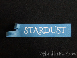
Step 10: Curl your banner
I curled my banner with my pen. After I curled both ends up, I pressed the bottom one backwards a bit and curled the top one even more with a smaller tool. Then I pulled the curl of the top one down so you could see the spiral.
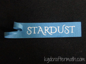
Step 11: Adhere the banner to the background
To adhere the banner to the background, I used my tape roller. I also added a bit of tape to the end of the bottom curl to keep it down a little more
Step 12: Add your flower
I used elmer’s glue to adhere my flower. It’s a bit heavier duty than the tape. Just a dot will do. Hold it down for a minute or two to make sure it takes. After a few minutes, pull your stamen back up and re-shape the flower if need be.
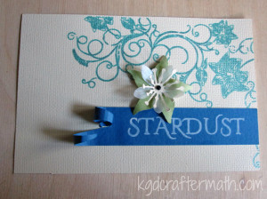
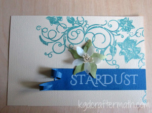
That’s it, you’re done! Put your new artwork into your shadow box, hang it on the wall, and enjoy!

And here’s your craftermath. This one isn’t too bad, but if you’re not careful you’ll have paper bits hanging around your house for a while!
What do you think of today’s project? What book would you turn into wall art if you could?
This post has been added to a link party! What does that mean? Well, it means that a bunch of crafty people all got together to share the fun projects they have been working on. To see more fun stuff, head over to That’s Pinteresting! hosted by the House on Hillbrooklane.
]]>Ok, now onto the fabric inspiration. There are a ton of generic fabric scrap ideas out there, so I’m going to focus my blog choices to things that have a bit of a geeky flare to them today. If you want to see some of the more mundane ideas, head on over to my pinterest board for inspiration there.
Steampunk Softees
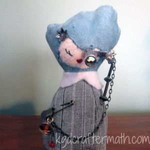
These are pretty awesome if you ask me. This is one of two steampunk softees that I’ve made myself. She is made with left over suede from a pillow (the hair) and some suiting that Earl used to make one of his suits (the body). This is cheating a little bit since all the patterns are available in Sarah Skeate and Nicola Tedman’s book: Steampunk Softies: Scientifically-Minded Dolls from a Past That Never Was. I figure it’s ok though, since Make: featured the bookand they posted a free pattern to make Marvaletta O’Houlihan, who just happens to be the softee I made above. They require a bit of hand stitching and a few findings, but I think they are pretty awesome way to use up those little fabric scraps that are always left over at the end of a project. And they make awesome stocking stuffers or birthday presents for the right person.
Make a Quilt Block
Weeping Angel from Whims and Fancies
Quilt block are really multi-functional. You can use them to make a quilt if you really want, or you can just make a single block and frame it as a photo. Or you can add some heat-resistant batting to it and use it for a pot holder. Or you could frame it with terry cloth and turn it into a towel for your bathroom. Or you could integrate it into a simple bag. Ok, I’ll stop now. But my point is you can do lots of stuff with quilt squares. And there are a ton of really cool and nerdy patterns out there. This beautiful weeping angel came from Whims and Fancies. I also suggest going to Fandom in Stitches and checking out some of their free patterns. They have patterns for Lord of the Rings, Dr. Who, Harry Potter, and even The Muppets.
Make a Tribble!

Tor.com : A tribble!
This one only works if you have furry fabric from something, but still, tribble. You could also cut up an old stuffed animal that you don’t want anymore. I’m not sure why, but the idea of cutting up a stuffed animal to make a tribble seems somewhat cannibalistic. Torie at Tor.com has an awesome step by step tutorial on how to go about making the pattern, cutting your fabric, and sewing it all together. All in all it’s pretty easy and I suggest you go check it out and make a tribble (or several hundred, they do breed worse than rabbits you know).
Make a Dalek pincushion
Dalek Pincushion: Craftster.org
This wicked cute Dalek pincushion was part of a craft swap at craftster.org. No pattern, but I think the idea is really great and I imagine if you were sewing inclined you could probably improvise. The best part is that you could make your Dalek with whatever color leftover fabric you have!
How about a Brain Pincusion?
Brain Cushion from Tiny Little Life
This tutorial at Tiny Little Life makes use of a piece of scrap fabric, some piping cord, and the Hilbert curve to make a brain pin cushion. It looks so cool. I also love that she used math to make brains. It’s just so… apropos.
Make a minion
Punk Project’s Minion Phone Cozy
Everyone needs minions, right? If you have the right colors, you could make this minion phone cozy to keep with you all the time! She uses felt, but you could use some regular cotton and line it with batting if you wanted as well. The tutorial goes step-by-step through the process and if you are using felt it’s really pretty easy. Check out her archives as well, she’s got some pretty cool stuff there. Her Angry Bird Ornaments also fit the bill for a scrap fabric project.
I hope you got some inspiration from these posts! Fabric scraps can be used for some pretty awesome small projects. If you want to see some more fabric scrap ideas don’t forget to check out my pinterest board for scrap fabric ideas. What do you do with your scrap fabric? Let me know in the comments below, and thanks for tuning in!
]]>Hour 12: It’s a sock!
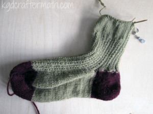
So this is the point where I can officially say I have a sock. It’s a no-show invisible sock, but I could ostensibly finish it off here and call it a day. I didn’t though, nor was I tempted too, but it was still an exciting point. For the next sock, I think I will join the heel back with the green with a simple knit stitch. You can kind of see a little bit that using the rib stitch made it a little messier than I would like. I also messed up a bit on the first few rows, but you can’t tell unless you really look for it. You should be proud of me, I didn’t rip out my stitches to fix a little error!
Hour 13: An ankle sock
At this point I’ve pretty much decided to title by the sock length. I’m mostly guessing at the right size based on pictures and how it fits on me. At this point I took the sock off and tried it on to figure out how long I wanted it to be. It fit like a glove. Remember earlier when I said I was worried that I was headed for disaster by putting the heel on at 4″ instead of 6″? Well, I need not have been worried. This is also about how long I usually wear my socks.
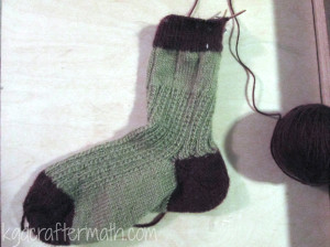
Hour 14: Quarter Crew
This is about the right length for an ankle sock. While it isn’t even half of what the pattern suggests before switching to the letter boxes, I will probably switch soon. I’m trying to go for a 3/4 crew I think. The pattern calls for an additional 3.5″ in stitching after switching, so I think it’s about time to switch. I want to count how many rows I’ve done and record that so that I can make the second sock the same height.
Well, that’s all for this week! Join me on Friday for some web inspiration on what to do with fabric scraps. Oh, and let me know in the comments what you think of my website (re)design!
]]>Ikea Hacker’s nature inspired blind.
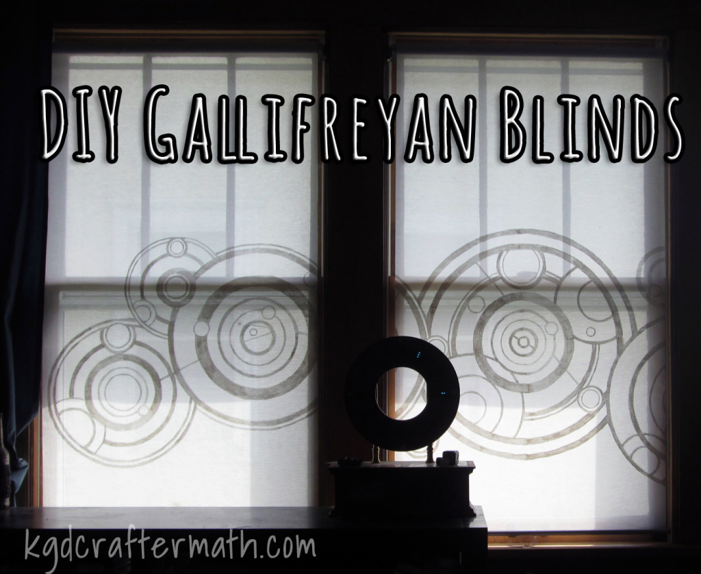
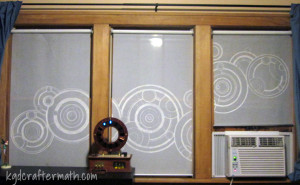
I really liked the idea of adding a distracting pattern, and what better geekier thing to do than the Dr.’s name! If you don’t know who Dr. Who is, go wikipedia it for a brief primer. Basically he is a traveler through space and time who encounters all sorts of issues and usually saves the day through some hair brained scheme. There is a lot more to it, but I’m just hoping you know what I’m talking about by now. If you haven’t seen it and want to watch some Dr. Who you can do so on netflix. The Oncoming Hope has a really good article on which episodes you should watch if you have never seen it before. Or you can just start at the beginning of the 2005 reboot. That being done, you should know that the doctor comes from a place called Gallifrey. Gallifreyan script is really pretty and composed of overlapping circles. In the episode “A good man goes to war” we have the pleasure of seeing the doctors name on the side of his old cot. And so, the idea was born to paint the doctor’s name in Gallifreyan script as a triptic across my brandy new ikea blinds. And now, with this nifty tutorial, you can to!
Update 8/30: If you find yourself trying this project yourself and want to ask questions, feel free to email me at [email protected] or catch up with me on facebook. I’d love to see how yours come out!
Materials
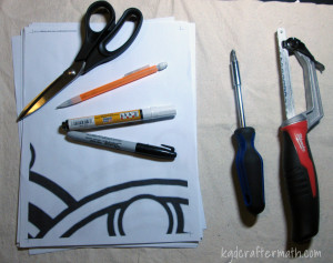
Handsaw
Fabric scissors
Screwdriver
Fabric pens
Pattern
Blind
Step 1: Cutting the blinds to fit
No pictures here, since I wasn’t blogging then and Earl surprised me by cutting them one day when I wasn’t home. It’s pretty easy though. Ikea sells the enje blinds in a variety of sizes. If they don’t happen to have your size, you can always buy one size up and cut it down. Here is how to do it.
1. Measured for length. Mark the amount you need to remove on both rods.
2. Remove one side on the top and the bottom. slide the bottom out.
3. Cut the fabric to the correct length with your scissors.
4. Use your hacksaw to cut the rods down to size.
5. Replace the bottom rod.
6. Screw your ikea mounts into the window frame and mount your blinds.
If you want pretty pictures of how to do this, I would suggest you go Door Sixteen, she has some nice pictures and goes though the process in detail.
Step 2: Create your pattern.

I used Photoshop to separate out the script into 3 equal parts, since I have 3 windows. Then, I re-sized each image to 29″ wide, which is slightly thinner than my blinds. You can do this in your choice of graphics program. If you want, you can use the file I created. It is hosted on Google Drive as a .pdf here. It is sized for 3 29″ windows, so if you are using a different sized shade you will need to re-size it appropriately in a graphics program first.
Step 3: Print your pattern.
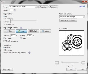
I saved my pattern as a .pdf so I could use the ‘poster’ print settings. Use the settings above when you print your pattern. This will print your pattern out at full size across multiple pages, I had 36 printed pages total. Don’t bother to try and tape them together, rather leave them separated for the next part.
Step 4: Trace your first blind.
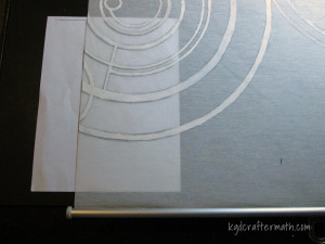
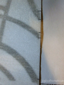
Note the distance from the bottom.
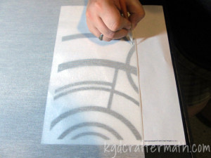
Start tracing with this piece (bottom right of the left panel).
Because the Enje blinds filter light through, you can see through them to trace your pattern directly onto the blind. Starting with the right blind and lower left page from your printout. Align your page to the side of the blind leaving some breathing space below the paper. Trace all the lines on that page in light pencil. Now, align your next page with the lines you traced on the blind. Continue this process until you have traced an entire blind.
Update 9/21: Reader Malin had a great idea, use tailor’s chalk on the blinds! It will erase easily if you are trying to center the image and need to re-position.
Step 5: Trace your second and third blinds.

Mark the edges from the other blind in pencil (exaggerated here so you can see it).
Then line up the paper with the marks.
To align your second blind to the first blind, arrange them so that the bottoms are even and overlap the side slightly. Make a mark for each mark on the traced blind. Use these lines to align the paper on your second blind. The middle blind might require you to extend your lines a little bit. Complete tracing this blind as you did the first. Then use these sames steps for your third blind.
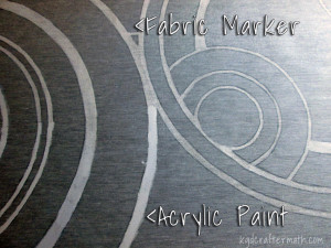
Step 6: Paint your blinds
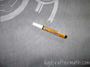
To paint the blinds, I used both regular acrylic paint and a fabric marker. The fabric marker wasn’t as thick and I had a bit more control, so I ended up using that. It took me 12 markers in total to complete the blinds. As soon as I realized that I would need a few, I bought them in bulk. I have since learned that you can re-fill the pens with fabric paint. If I ever do this again, I’ll make sure to do it that way.
Update 8/30: Tip: Try to keep your strokes going in the same curve as the circles. Do medium to long strokes and overlap your sections. Don’t create vertical or horizontal lines, as those stick out at the end. If you look at the middle curtain closely you can see where I made some vertical guide lines.
8/31 Tip: I found it easier to have the blind hang over the edge of the table, pull it tight, and then paint the part in the air. That way the paint didn’t seep through onto the table.
8/31 Tip: If you are using several markers, vigorously shake them before opening them. When you open a new one, blot it on a paper towel just in case the first bit of paint is runny. It should thicken up quickly. Some of my markers were very watery, and I ended up having a big blob on my right blind I had to clean off.
8/31 Tip: If you need to remove the paint, use a paper towel with isopropol alcohol and lots of elbow grease.
That’s it!
This project probably took me a month and a half to do, but only because did it sparingly in my free time. You could probably finish this in a weekend if you dedicated your weekend to it. Since I did the project over a long time and because there isn’t much mess, there is no craftermath. However, I hope you enjoy these photos of the finished project from different views!
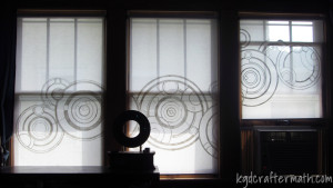
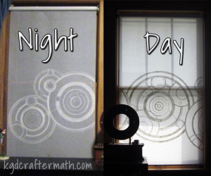
An Inside view during the day.
A view from inside at night
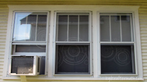
An Outside View
Update 8/30: Here’s another picture, this time from the outside at night. You can see how the shade allows you to see what’s inside, but the pattern obscures the view and draws your attention. You could still see inside if you really wanted, but it keeps the casual passer by from getting a birds eye view of your house. I wouldn’t walk around in my knickers though, just saying.
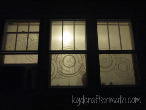
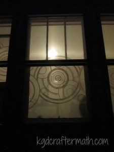
Outside view at night
Thanks to everyone who has featured this post!
![]()


![]()
![]()

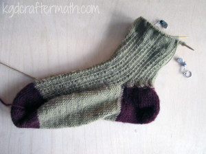
Hour 7: Getting to the heel.
I don’t know why I took this picture from this angle. Maybe it was to show that I went back to working with two needles again? I don’t know, but it’s weird. So, sorry about that. After another hour the sock was long enough that I felt it was time to go onto the heel. I was a little worried that the pattern was having me make the sock too long, so I moved onto shaping the heel a bit early. I am hoping that this was the right decision, but since I’ve never knit a pair of socks before, I could be in for a disaster going forward. I am hoping for the best. When I hit the edge of my heel, I switched back to two needles so I could work the heel and leave the top in tact. I plan to switch back to a single circular needle when I’ve finished the heel.
Hour 8: Starting the heel.
First of all, look at how the sock is now forcing me to photograph it length wise. It makes me happy. Figuring out how to knit a short row heel was somewhat difficult for me having never done it before, as you might have guessed from this week’s tutorials. It took a little while for me to do so, which is why you don’t see too much progress during this hour. But, I eventually figured it out and here you can see the first few rows of the heel.
Hour 9: More Heel
Nothing too special here, just a few more short rows.
Hour 10: Going back towards green
Truth be told, this photo is from between hour 9 and 10. However, it shows a pivotal point for me. This is where I hit the half way point of my heel and started heading back towards working the non-heel part of the sock. Yay!
Hour 11: Finishing the Heel
Woot, the heel is done! I’m ready to switch back to my green and work on the upper part of the sock. Yay! I’ll probably pull it off the needles again after a bit to try it on. I also need to decide just how long I want to wear it. I usually wear low cut socks, but this one won’t work so well that way. And I do wear longer socks in the winter. It’s Minnesota, it gets cold here. I am hoping that at this pace I can finish the first sock in the next two weeks.
I think I addressed this in my Crafting Hour post, but I wanted to take a moment to say that I hope these hourly posts inspire you to try something new. Part of the reason I want to do them is to show people that even if they can only craft in small chunks of time, you can still be productive and create things that make you happy.
Speaking of happy, what types of crafts do you do to wind down or get away from the world? I like to try everything, so I’m always up for something new!
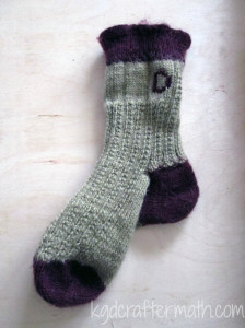
]]>So, I went searching high and low to try and find some yarn that would go with my purple to no avail. The best I could find was to purchase it online for almost 5 times the in-store cost (plus shipping). This did not sit well with me, but I found another option. In searching high and low, I visited several specialty yarn stores and found some much nicer yarn that fit the original colors a little better. And it was on sale for 35% off! The sad thing is that it was on sale because said yarn store is closing. :( While I never visited the establishment much since I don’t knit too often, I do like frequenting small craft stores for my materials. They usually have a better selection with better quality materials as well. Long story short, I bought new yarn and started over. I did pull a piece of yarn through my stitches and secure it so I can go back to that purple toe later if I want to though. Here are my new materials: Note that I went with a yellowish green instead of bright gold, which is closer to the original. The purple is more maroon than purple, but it was the best combination I could find. It’s also a really nice Superwash Merino instead of a polyester, so it’s definitely a step up material wise. My toes will be nice and comfortable in these! Below is a picture from the pattern for comparison.
Dumbledore Socks from Knitting Daily
The good news is that it didn’t take me nearly as long as last time since I knew what I was doing a little better. I was able to keep the increases a little better, though there were still a few dropped stitches. And I figured out how to cast on in a manner more suited to my style of stitching (more on that later). It did take a while to wind the yarn into balls as well, especially since the maroon got all tangled. I didn’t add that into my progress bar though, just to try to make myself feel better. I think it took around 3 hours. Earl was starting to get a little worried I wouldn’t eat since I insisted on untangling it first…. Here is my hourly progress:
Hour 1: Casting on and increasing
Hours 2 and 3: More increasing
Here is a comparison between the two toes.
Several things to note: the width is about the same, but the length is different. This is due to the fact that I messed up so royally on the first sock and kept needing to increase stitches. Then I needed to decrease them because I put in too many. This time around, I was much better with my increases and the number of rows is correct. Also to note is that the toe looks different. This is because I cast on differently. I still used Judy’s magic cast on, but I did it backwards so that the needles were in my left hand when I cast on. I did it this way because when I originally taught myself to knit I managed to teach myself how to knit on the back stitch, instead of the front stitch. This means that all my knitting is, essentially, inside out. For almost everything (scarves, sweaters, blankets, hats, etc.) this isn’t a problem. However, because of the way this cast on works, I ended up with a weird seam. By switching the direction of the cast on, I was able to have the seam integrate into the sock the way it’s supposed to. Stupid weird idiosyncratic way I knit….
Hour 4: Adding the green.
Ok, confession time. I did this twice. The first time I did it I totally screwed up somewhere along the line and my seeded stitch got all wonky. That’s the part that looks like alternating high and low rows for the knitting uninitiated. (Don’t worry, I had not idea until now either. Consider me uninitiated. Remember the self taught bit?) Anyways, I tried to fix it, but I kept making it worse. So, went down to the purple and started up with the green again. The good news is that with all that messing around, my pearling is coming along well. And once I did that, this really did only take an hour. So that’s awesome. Now, I’ve got 6 inches of this to knit before moving on to something else, so expect the next couple of ‘hours’ to be just extending this.
Hour 5: More Green!
This hour was a particularly interesting hour. I had the fortune to visit a friend of the family, but she lives a little more than an hour away. I thought I’d pass the time knitting. The twist here is that it was a gorgeous day, so we decided to drive with the top down on the convertible. I bet if anyone realized I was knitting with the top down they’d really get a laugh out of that! Anyways, here is the fruits of that particular hour’s labor. I feel like I’m starting to move a bit faster too. despite to odd circumstances!
Hour 6: More green!
This was another car hour, but no hood down. I’ve got about 3 inches of green done. Another 3 to go before I start on the heel. Sarah asked about the heel before, it is a short row heel. Here is the current progress.
The sock feels a little big, so I think I might use some scrap yarn to remove it from the needles and try it on. But there you go: A whole week’s progress in one post. And six hours to show for it! Thanks for tagging along so far!
]]>