Christmas Ornament by Downtime. Upcycle
Normally I don’t choose favorites, but this is definitely my favorite of the bunch! I love the mix of green plus the berries. The snow like material and the words at the bottom add an extra fun touch to the ornament. While it didn’t make the final cut for this year (you’ll have to wait for December to find out what did), I’m hoping that we can do something inspired by this ornament some future year.
Terrarium Place Holder by Wednesday Custom Design

Earl really likes the terrarium look, so even though this isn’t technically an ornament, it made our list. The look is rather elegant, and could be converted to a globe ornament without too much trouble. I think it would also look good with a red flower and maybe some white berries. Or switch the colors around a bit? Any which way, it’s very elegant.
Alcohol Inked Ornaments by Lisa’s Craft blog
Pretty pretty blue! I really like the aged look of these ornaments. There were a few faux mercury ornaments which had a similar effect. I chose this one for the blue though, it’s so pretty!
Rosemary Filled Ornaments by The Cheese Thief
Here we are again with foliage! Rosemary looks almost like little Christmas tree branches in the bulb! I really like this idea, and might try to grow some extra rosemary one year and dry some up for this purpose.
Mario Chomp Chain Ornament by Nerd Freakin Tastic
I love this ornament! It’s so much fun and adds a bit of geeky flair to the tree. Plus, it makes you smile, and anything that makes you smile is a good thing.
Well, there you have it. Five ornaments that helped me convince Earl that we can make nice looking hand made ornaments. Now we just need to figure out how to date them! To see the rest, head over to my pinterest ornament board. I hope your week is going well, and I’ll see you all again soon for Finished Friday!
]]>
Now, it didn’t start that way of course! Since I took pictures along the way, I thought I’d show you the WIP (work in progress). Please bear with this image heavy post. I’m not sure why I feel the need to tell you all that though, since most of my posts are… Oh well!
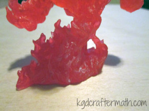
The mini I painted is Reaper’s Large Fire Elemental. It’s made of a translucent red plastic. For the lighting effected, I used a cheap halloween LED tea light.
I wanted to take advantage of the transparency and use some light, so I did some fiddling around. I played around with a Halloween led candle from Target. I also played around with a few other leds, but I found that the target one was the brightest. The only problem is that the light doesn’t penetrate the mini fully. With the non-target led, I placed it at various points behind the mini to see if I could get better spread, but it didn’t look like I could. I did drill a hole into the mini so that the led would go up a little bit, but I didn’t go so far as to de-solder the led from the board to make it longer. I might try that with my other fire elemental, but I didn’t do it here. It did help a little bit, but I would still like to get more light through overall.
The very first thing I did was painted the elemental. Bones, that’s the plastic the mini is made out of, is super hydrophobic. I wanted to keep the transparency, so I knew I wanted to do a thin wash of paint. Normally you would make a wash with water and paint, but the material is hydrophic, remember? So I made my washes with isopropyl alcohol. Fire goes from really light in the center to red. I added the black sooty stuff on the outside to help with the fact that the led didn’t shine through the whole thing. I used a low ISO photo above to help determine how to paint the mini in accordance with the light spread.
First up: a coat of pure white around the bottom
Next: a coat of sun yellow just above the white
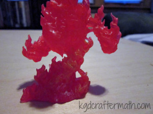
Then: a coat of fire orange above that. Note that these coats only go up to about half of the figures. That’s where the light mostly ends.
Next, I dry brushed a bunch of black on.
Then, I dry brushed some crimson red around the bottom. I didn’t want the bottom to be as dark as the top, though you’ll noticed I changed my mind on that later down the line. Somehow I forgot to take pictures of the last three stages, but, you can still see how it came out in the next few steps.
Once the mini was painted, it was time to add the LED light. First, I removed all the casing from the candle. This left me with the board, the bottom housing, the led, and the battery.
I had already drilled a hole into the fire elemental that went in as far as the led would go. This is where I could have done a bit more. I decided I didn’t want to deal with de-soldering and lengthening the led. This would have allowed me to put it further towards the middle of the mini and potentially have gotten a more even lighting throughout the mini. I should note that I wanted to keep the board because it flickered and it had an on/off switch. Sure, I could have done those myself, but it was much easier and cheaper to use the led candle.
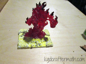
Now the electronics and the mini fit together! But… they need a base. I placed it all on a 2×3″ base. Why that size? Well, it’s what they had at my local shop. So there you go. Once I traced out where I wanted the led casing to go, I marked where the switch was. That was where I drilled a hole. You need a pen or something to turn it on and off, but at least you can.
Then it was down to decorating the base. I knew that I wanted to hide the electronics. Also, I wanted a lava effect, so I started by sculpting a crater like thing around the LED strcuture with some milliput. Milliput is also a very strong adhesive, so this keeps the mini attached as well. I like to imagine that the fire elemental is emerging out of the crater.
For the raised bits of pumice and other refuse in the lava, I used some cork. There is a larger piece of cork on each corner and then some crumbled cork that I added around the crater. All the cork is adhered using zap a gap super glue. I used the tutorials by Dark Art Studios and Fantasy Games as inspiration and for help in figuring out how to get the look I wanted.
Once the cork was down, I flooded the base with Elmer’s glue. And waited for it to dry. And waited. And then gave up waiting, and hit it with a blow dryer until it was at least dry enough for me to paint on it. Bonus! Since the glue wasn’t entirely dry, I ended up smudging it some along the way. This gave the lava a swirled effect in some places, which was kind of cool.
Then I started layering on the color. Most of the color is dry brushed or just sort of haphazardly splattered about.
First: a (mostly) solid True White coat.
Dry brushed sun yellow
Dry brushed marigold yellow
Dry brushed lava orange
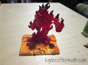
Dry brushed crimson red
Dry brushed blood red
Added a layer of walnut brown to the top of all the cork (I left a little of the red showing). I also added a ring of brown just underneath the elemental.
Added a layer of black to the tops of the cork (I left some of the brown showing). Finally, I decided I wanted to dry brush some more black onto the main figure. That’s it!
Then it was into the light box for some photos!
It took me evenings, one for the electronics, sculpting, and mini painting, and one for the base construction. Not including drying time, I think it took me 3-4 hours to complete. I hope you enjoy it! I’ll probably apply the same treatment to my other large fire elemental, except try to get better lighting by drilling a deeper hole. I’ll be sure to post it here if I do!
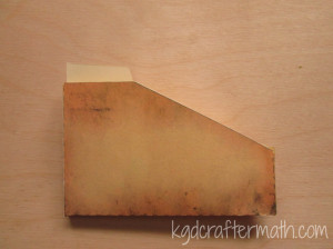
]]>If you play Dominion, you are familiar with the storage issue. Currently there is the base game plus 8 expansions, and a secondary set of base cards. This translates to 8 large boxes (12x12x3). So, you can imagine how much space that takes up! Thankfully, many people more organized than I have come up with storage solutions that cut that space down. My favorite diy solution is Drew’s Dominion Storage Solution. I started doing this once before with Earl, but we ended up abandoning it because it was just too much hand cutting. All the artwork here is Drew’s, but he’s expressed permission for people to create cut files in the past. Here’s where the silhouette comes in! I created a cut file for each of the boxes so that I could have my Silhouette do all the cutting! It still takes a long time, but much less than before.
This tutorial is uses the print and cut feature of the silhouette (which I LOVE), but you can also download the original .pdf version of the files by Drew here. I am working on creating print and cut files for all the templates along with sticker templates. For now, You can find .studio files for all the folders and the small box here. The sticker templates are annoying and forthcoming. I will defeat them!
This project was done over 4 evenings that ranged from 2-6 hours (not counting the time to create the silhouette file). So, it’s hard for me to estimate how much time it took, but it was totally worth it! I don’t have all the expansions, so I can’t confirm that all the expansions will fit in the original box this way. I think that at some point, we may switch to a different box, but for now I’m happy with the original box. Note that these are not sized for sleeved cards, though I might modify the templates if I have time for that in the future.

Materials
Cardstock. The amount you need will depend on which expansions you need (see step 1)
Double stick tape roller / glue stick / double sided tape (any adhesive really)
Printable sticker paper (I highly recommend the silhouette sticker paper, more on that below)
Step 1: Print everything you need
How much do you need? Well, that’s a really good question that depends on which expansions you have. Here is a list of what I needed. If you are using the .pdf versions, go ahead and print out that number through your .pdf reader (at 100% size) now. Make sure to print the labels on sticker paper. If you are using a silhouette, we’ll cut in the next step with the print and cut feature. I am working on a guide that will include all the expansions
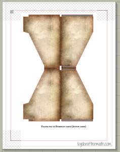
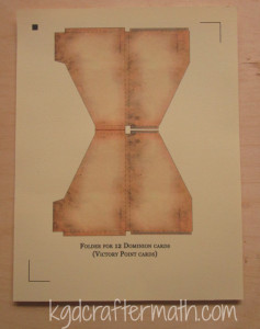
Dominion (20 sheets total + boxes): 2-60 folder (copper, starter decks), 1-40 folder (silver., randomizer + trash), 1-30 folder (gold, curse), 2-12 folder (2 x estate, duchy, province), 12-10 folders (24 action cards)
Alchemy(9 sheets total + boxes): 2-12 folder (vineyard, randomizer), 6-10 folder (11 action cards), 1 20 card (potion)
Hinterlands(17 sheets total + boxes): 1-30 folder (randomizer), 4-12 cards (farmland, silk road, tunnel), 12-10 cards (20 action cards, 3 treasure cards, blanks)
Do yourself a favor and buy extra paper. I wouldn’t print extras unless you mess up and need to, but I needed to that and it’s better if you don’t have to go out and purchase more paper when you are in the middle of your project.
Step 2: Print and Cut.
Now can I gush about the silhouette studio print and cut? It’s awesome! I’ll be doing a tutorial later on how to turn a paper cut project into a print and cut , but for now you can just have the tiniest taste. In your studio file, you should see some weird hash marks, a box in the upper left, and then some corners. These are your registration marks. If you don’t see them, make sure to hit the registration button ![]() and check “Show Reg Marks”.
and check “Show Reg Marks”.
Once your registration marks are showing (oh my!), go to File – Print and send your file to your printer from within the studio program. If your cardstock is not coming from the regular paper tray, make sure to fix that by choosing printer preferences and selecting the appropriate choice. Mine feeds from the back tray. Since every printer’s options are different, I can’t really guide you too much here.
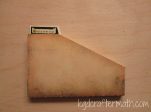
Now adhere the paper to the cutting mat, load it into your silhouette, and send the file to your machine. I highly recommend watching it register. I had a few mis-registrations that cut the paper in the wrong places. If you catch it early enough, you can pause and cancel the job. If this happens: check to make sure the lines printed correctly, turn the machine off and on again, and restart the program. It’s usually only one of the above problems, but by doing all three at once you don’t have to stop it again if you chose the wrong fix. After you remove the excess paper, you will be left with your piece! Note that all but the 60 folder template will create 2 boxes per page.
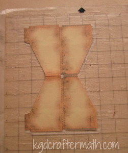
Rinse and repeat until you have all of the folders that you need. You may need to re-stick your cameo mat during this process. For the 40 card folders, the cut lines bleed outside of the registration marks. This means that you will need to finish the cut yourself either by hand with an x-acto blade, scissors, or your favorite cutting tool. I also suggest using coverstock or a heavier cardstock for the boxes that will hold all your folders.
Step 3: Assemble the Folders
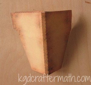
Now for the mostly easy part! The print and cut file has already perforated your fold lines, so fold everything up and inwards, slap some adhesive on those grey bits, and stick it together!
Step 4: Label the Folders with the Stickers
Here’s the thing with the labels, if you are are a stickler like I am, you want everything to be alphabetized and alternating just so. This means that the templates need to be arranged depending on what expansions you have. I’ve been working on making the sticker templates for each individual expansion and for all the expansions, but I can’t customize for each and every possible combination. So, when I do finish the sticker templates, be aware of that. You’ll notice in my final image, I still need to fix my sticker templates to fit the expansions I have!
Actually adhering the stickers though is really is. It’s just a sticker, after all. I really liked the silhouette sticker paper because the clear sticker has some weight to it, so that even when the backing is pulled off the sticker is still nice and strong. Here’s a labeled folder to go with all that chatter!
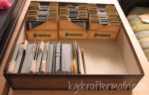
Step 5: Organize and Oggle!
Or, if you are like me, organize it and figure out that you need to re-do all the stickers so that everything looks better! Never fear, when I get those downloads down you won’t need to do the perfectionist re-thinking things. Dominion storage = conquered!
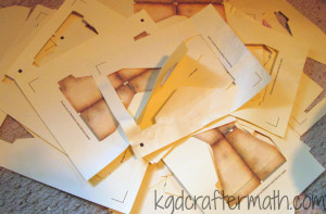
And what about the craftermath? Well, this project mostly makes a bunch of excess paper. What you see here is a pile of all the excess bits plus the bad cuts/prints. I had quite a few ![]() . I like to shred mine and keep it as bits. I’m hoping that one day I’ll have enough bits to try my hand at making my own paper!
. I like to shred mine and keep it as bits. I’m hoping that one day I’ll have enough bits to try my hand at making my own paper!
I’ll be back next Friday with downloadable templates and an even prettier picture of my own Dominion organization. See you all soon!
]]>
First, a bit about Reaper. Reaper Miniatures is a company that makes plastic, metal, and resin miniature figures. They are used for all types of gaming (war gaming, strategy gaming, board game replacements, role playing games, etc.), but we use ours primarily for role playing games. I’ve always wanted to get into miniature painting, but it was too cost prohibitive to get a bunch up front for gaming use. That changed last year when they kickstarted their bones line. A bones mini is cheaper than the metal mini (often by 1/3 or more) and is harder to destroy. With the kickstarter, we got a ton of minis for what ended up being less than $1 a mini, even with getting some of the more expensive ones. They have announced they they are doing another one, and soon, so if you’re interested keep your eyes peeled!
I enjoyed the community enough that I started an account on their forums. Though I don’t go there too often, I liked the idea of a mini exchange. The way it works is that everyone interested sends their information and any preferences on what they want to receive and can or cannot do to an organizer. For example, if you only want fantasy miniatures and not sci-fi stuff you can say so. Everyone ends up painting one mini (or more if they want) and sends it to the person who’s information they are given. Sometimes the person you paint for also paints for you, but it’s really more like a big circle of exchange. My partner wanted a fantasy mini and likes shades of purple, but had no other preferences. I chose to paint up the female wizard Sharyn sculpted by Julie Guthrie. Here she is!
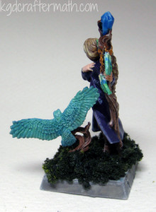
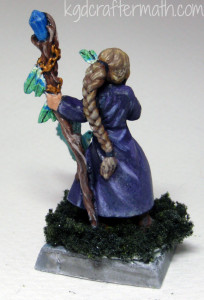
I’m mostly happy with the way she came out. The bird is a second miniature that I added onto the base, since I felt she really needed a companion. For the woman, I stuck with a purple robe and then decided to go with blue under clothes. Despite Earl’s pleas for green gems, I kept with the blue. I am not entirely happy with the wood tones. I did the two pieces separately, so while I could use a similar color pallet, they weren’t exactly the same. I’m also not sure how I feel about the really light highlighting on the staff. I’ve decided that since the staff is essentially dead wood, it’s ok, but I’m still not entirely happy with it. I’m a little more pleased with the bird’s branch. Likewise, had I painted them at the same time, I would have probably changed up the colors of her feathers to match those of the birds. But, I did have a deadline, so it stayed the way it was. I’m not so happy with the boots either, I think that shading needed to be a bit more subtle. I’m mostly happy with how the hair turned out, though I do question some of the highlight placements in the front. The hand is, well, it’s eh. I just need more practice in understanding how skin highlights really.
While I really like the girl, I have fewer critiques for myself on the bird, even though I spent less time on it. I’m happy with how the blue/green speckling came through. I wanted it to be reminiscent of birds with shimmering color-changing feathers. I also really wanted to have a white breast, and I think I did the transition there well. The one thing I could have done to help with that a bit is to go over with a dry brush and highlight with some true white and let the leather white act as a deeper shadow.
For the basing, I just painted everything in stone grey and washed it with stone shadow to give it a color base. Then I covered the whole thing with forest green flocking. I like how it hid the parts of the boots that I disliked the most. Also, I ended up rubbing off some paint and primer on the base, so instead of having to go through and re-prime and paint the bottom, it nicely hides those errors. On the last photo you can see a bit of a lip where the mini was glued to the base. I should have gone back and added a bit of flocking to that as well, but it is what it is.
I’m really happy with this mini in the end. It was my first try with a wet pallet and my first black lining (you can see that a bit in the face). I also focused more on using several layers of thinned paint to shadow and highlight instead of relying on washes and dry brushing. I almost didn’t want to send her out to my trade partner since she’s probably my best mini yet and I spent so much time on her. But, truth be told, I was inspired to do all that work just so I could send off an awesome mini. So off she went! He’s since received her, and the response was one of joy (he said thank you three times!), so that was well worth it. Thanks for reading!
]]>